This is a 4 part series on annoyances I have with roguelikes. Last time we covered Identification.
In my first article, I asked why traditional roguelikes aren’t nearly as successful as action roguelites. I found a reddit post asking a similar question: why is a super difficult game like Binding of Isaac so popular anyway? Here’s the top comment:
Despite its difficulty it was accessible. Load it up, hit play, everything you need to know is written on the floor of the first room. Despite this, it has depth, skill and replayability…
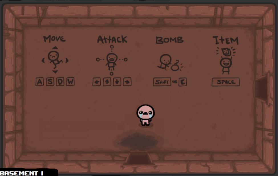
There’s a ton of sense in that answer. If I had to sum up all the problems with traditional roguelikes in one word? Accessibility. And there’s nothing that epitomizes that inaccessibility better than really terrible controls. This isn’t going to be a long post because my point is simple: let’s stop making games with shitty controls.
Move over Martin Luther
How bad is this control situation? Am I exaggerating?
Nethack has 95 separate key commands. NINETY FIVE. Try writing that on the floor.
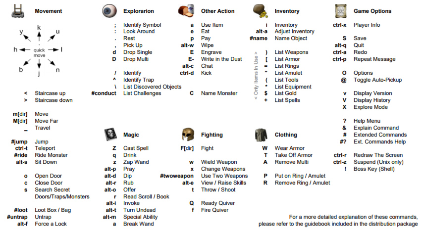
It’s not just that there are so many commands, but also many of them require multiple keys. Many require you to remember the difference between lower and uppercase. Many are known standards among roguelikes, but will appear completely arbitrary to a newb (like . for rest).
Contrast that with Binding of Isaac. As you saw earlier, it has 10 keys. Practically speaking, you only need to remember 4 things since groups of keys like WASD can be memorized as single units.
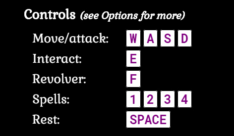
It’s a well known rule of thumb that humans can store about about 7 items in working memory. If your game has about that many controls (as BoI does), the game supports a pick up and play style. You can start having fun immediately. If it has dozens and dozens of controls to remember, it’s going to feel more like cramming for an exam. The learning curve is going to be painful. And when I say “learning curve”, I’m not even talking about achieving mastery and learning to avoid the many sadistic and brutal ways games like Nethack will insta-kill you. Learning controls, at least enough to be able to move around and perform common actions, is table stakes for actually playing a video game.
Back in the dungeon again
Learning isn’t the only problem here either. Since they take so long to master, roguelikes are often played over the course of many years and with long breaks in between. This is how I played DCSS over the last decade. I’d decide to jump back in, get utterly obsessed with it for a few weeks, and then drop it for months. Whenever I returned to after a long absence, I struggled to remember the keys for things like picking up items, casting a spell, or showing the religion screen (g, z, and ^). This is a pretty common experience.
Use it or lose it
Learning (or remembering) the most common controls is one thing. It’s a hassle, sure, but you gotta do it.
The more insidious problem is all those rarely used commands. Those keys I couldn’t remember in DCSS? You don’t strictly need them to play the game:
- g: Most useful items are picked up automatically
- z: Many kinds of characters can survive the early game without reliance on spells or abilities
- ^: It’s possible to ignore most of the menus most of the time
On the other hand, every key has a purpose. If it didn’t give you a better shot of winning, it probably wouldn’t be in the game:
- Some helpful items are not picked up automatically by default and require a manual keypress
- Not using abilities/spells is a common pitfall for new players that gets worse later in the game
- Menus like Religion or Skills expose a lot of important details and choices
What ends up happening is I play with a small subset of the keys available. I occasionally get curious about other commands and hunt down the corresponding keys, but the next time I open the game I forget about them because I haven’t had enough practice. Thus, with whatever roguelike I’m playing, I usually find myself playing a fraction of what the game has to offer. Forgetting to use abilities, spells, projectiles, etc. Failing to squeeze all the resources out of my environment. Ignoring the consequences of my statuses and mutations. It’s Burden of Knowledge all over again. I suspect many roguelike neophytes are afflicted by the same problem and it’s partly why they find the genre so impenetrable.
Moderately sized packages
The goal should be pretty obvious. Fewer keys.
I understand if you’re skeptical. After all, roguelikes do have a good deal of stuff going on. Don’t you need a plethora of keys to deal with it all? Not necessarily.
I’d say the most important thing in a roguelike is movement and positioning. Attacking monsters, running away, dodging traps, opening doors, falling through shafts. These are all things that are already done with just the movement keys. Everything else is up for negotiation. And I do mean everything.
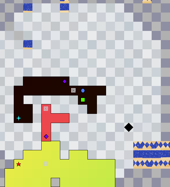
One of my proudest accomplishments during 7DRL was making a game that only uses 4 way movement. Here’s the things you can do in DUMUZID with just 4 buttons:
- Move around
- Attack monsters, sometimes instantly killing them if performed properly
- Take portals to other floors
- Pick up spells
- Cast spells
- Carve pieces of yourself off of… yourself
- Activate score runes
- Pray
I use this example to demonstrate what’s possible, to stoke your imagination, but of course not every game has to be as minimalistic. All I’m saying is keep your mind open and don’t assume the way it’s been done before is the right way to do it.
Here are my specific recommendations on controls:
1) The best key is no key
There’s a saying in the programming world: The best code is no code. If you can solve a problem without actually writing code, that’s zero bugs, zero debugging, zero maintenance.
Likewise, it’s ideal if you can design an in-game action without creating a new command for it. It means less space hogging up the help menu, fewer things to memorize, and a softer learning curve.
When possible, do things automatically. Auto-pickup is a great example. It really ruins the flow of a run when I have stop exploring the dungeon to pick up something. If it has a possibility of being good, the game should pick it up for me. If it’s useless trash, I question why it’s in there in the first place. Yes, implementing an auto-pickup system can impact the rest of the design. I think it’s worth considering the overall design just to get the controls right. Golden Krone Hotel has auto-pickup on everything. If you pick up gear and it’s better than what you have, you equip it automatically. Otherwise that item is immediately turned into gold so you can buy better stuff later.
Another creative example is found in Brogue. Most games require a separate keypress for taking the stairs, but Brogue’s maps are designed in such a way that walking onto a stair tile is all you have to do to descend.
2) Remove the kitchen sink
It’s simply ridiculous that roguelikes often use the whole alphabet. Why have separate keys for taking off armor and putting it on? Why two more keys for putting on rings and taking them off? When I see these kinds of controls, I have to assume the developer wanted to make their game as esoteric as possible. There’s no need for so many damn keys to manage your inventory because a single well-designed inventory screen could accomplish the same thing!
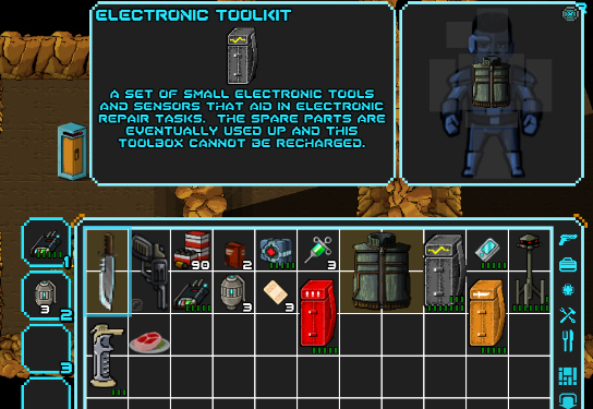
There’s usually a dozen keys to interact with the environment. For example: > to go down stairs and < to go up. The funny thing is I’ve never been on a tile that gave me the option to go up and down. So why have two separate keys? In Golden Krone Hotel, I have a single “contextual action” button that lets you perform all kind of actions.
3) 4-way is A-OK
I expect this to be the most controversial point but here goes. If you want to make a more accessible roguelike, at least consider going with 4-way movement. It has its own interesting tactical consequences, but more importantly it’s accommodating for laptop users who don’t have numpads. Many newer roguelikes focus on 4-way movement: Cardinal Quest, POWDER, Dungeons of Dredmor, and The Ground Gives Way. In my own game, I waffled a bit by eventually allowing 8-way movement to be an option but I still have 4-way as the default. I’m glad both camps are happy.
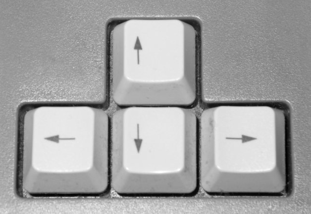
Yes, there are vi keys and the argument is always that “you get used to it.” Bollocks. You can get used to anything given enough time, like riding a backwards bicycle. That doesn’t mean it’s optimal or worth your time to learn. If it works for you, great. For everyone else, I’m cautious to take design cues from a program that millions of users can’t figure out how to quit.
If you’re going to force 8-way movement on laptop users, consider a more reasonable setup like QWEADZXC.
4) One menu to rebind them
There’s not much to say on this one. All games should have rebindable keys. Some people won’t be able to play your game without it.
5) Full Mouse
Making your game fully playable with only the mouse is really important these days. Not only will some players want to play the entire game with mouse, but it’s also a good fallback for anyone still learning all the controls. Besides, many actions like examining tiles, looking at tooltips, or aiming a projectile become much easier with mouse.
At the same time, roguelike veterans are used to playing with only keyboard. Be careful that you don’t accidentally make your game require both mouse and keyboard. I’ve fallen into this trap occasionally because it’s much easier to implement menus with clickable buttons rather than keyboard navigation.
6) Keypress hints
Though you should support mouse, it’s likely that keyboard shortcuts will turn out to be much more efficient. It doesn’t have to happen right away, but games should gently guide players towards being fully adept at keyboard play.
The best way to accomplish this is a keypress hint attached to every button. The button is there as a fallback, but the keypress hint is a constant reminder that a more efficient option is on the table.
Press z to clean up this mess
How did we get here anyway?
When Rogue was released, there wasn’t much else going on. Video games were still in their infancy and so were user interfaces in general (Graphical User Interfaces weren’t even a thing yet). Using every letter of the alphabet (whether for monsters, levels, or controls) seemed more like a feature than a bug. The bar was low and gamers didn’t have much of a choice. What were they going to do? Go outside?!?
Today’s gamer has a mind boggling number of choices (4000+ games released on Steam just last year) and a shortage of patience. If roguelikes want a snowball’s chance in hell of competing, we’ve got to do better. Controls aren’t the only thing that need to be improved of course, but they’re the first barrier to entry for new players. To be fair, most of my gripes in this post have been with older roguelikes (which I really enjoy playing). Newer, commercial roguelikes have gotten much better in this area, but I still see a lot of room for improvement.
Join us next time when we talk about Theme.
9 replies on “Things I Hate About Roguelikes Part 3: Terrible Controls”
This has been such a great series of posts, thanks for them. I’m looking forward to Part 4!
Thanks!
[…] our previous episode, we covered bad controls. I’ve yapped enough about annoying gameplay. Now it’s time to […]
Regarding stairs
That’s one thing that I think Caves of Qud did really well as far as controls (surprisingly :p ). > and < fast travel you to the corresponding stairs, and the basic action does the actual traversal. It stays in line with my mental mapping for other games while also simplifying the controls by binding those keys to a bonus and not a core feature.
Oh, that is rather brilliant but I somehow never knew it.
Controls are one of my pet peeves about roguelikes. I love DCSS but why does it have separate commands for Wield, Wear, Put On, Take Off and Remove? It’s ludicrous.
I understand that having a Wield command which is separate from other commands can make sense in something kitchen sinky like Nethack, where there are circumstances where you might want to Wield something that isn’t a weapon (in which case an all-purpose Equip command wouldn’t do the job). But those cases are infrequent enough that I don’t see it being a serious issue, and it certainly doesn’t account for why garments and jewellery have separate commands. So much work is done to make DCSS user-friendly but the control scheme remains as clumsy as ever.
Which reminds me – you mentioned a command to view religion details. I’ve ascended in DCSS twice and I didn’t know that command existed, which begs two questions: (1) Doesn’t that suggest too many commands, when someone can play that much and not even know about some? (2) How useful is that command really?
Angband is a puzzling example as well. It uses a general ‘w’ command to equip anything – weapons, armour, jewellery. But then it has separate commands for activating wands, rods and staves. Argh!
I’m a big believer that roguelikes in general need to have more thought put into their controls. There a few that do (GKH, evidently) but the majority seem to adhere to obnoxious control schemes simply because it’s always been that way.
We actually share a lot of the same game design ideas. A huge one with me for these types of games that almost aways turns me away is the sheer amount of (usually) overtly-complicated controls. And most just don’t make sense. A very recent example for me would be how in DCSS you have to press (f) to fire or throw projectiles. What’s that supposed to stand for? frow? There’s a million more commands I haven’t memorized yet, but I for sure have mastered the (?) key, since I’m always having to look up what does what. DCSS is a fun game so far but you should be battling monsters, not the interface.
GKH has a really good control setup, and better still you’ve also made playing it with a gamepad possible and seamless. This is how I usually play your game. Makes a huge difference. I did the same with my game as well. I didn’t want people to be scared away with complicated controls who might otherwise enjoy it.
Haha, somehow typing this out I didn’t realize that (f) probably means Fire. DUH. I had been throwing rocks and etc for so long it didn’t dawn on me XD
The instructions saw that pressing (v) is supposed to view an area but it keeps wanting me to invoke things. Eh. Maybe this is not the genre for me!
“Frow” was pretty funny. You are too kind!